How to Design a Printed Booklet That Readers Can Use
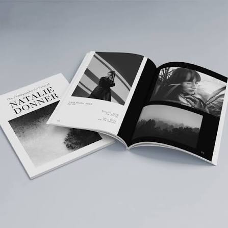
Table of Contents
- Start With a Clear Purpose
- Plan the Reader’s Journey
- Build a Simple Page Structure
- Choose Type for Easy Reading
- Use Images With a Job to Do
- Design for More Readers
- Select the Right Size and Binding
- Prepare Files Before They Go to Print
- Proof, Test, and Revise
- Avoid Common Booklet Mistakes
- Use a Final Production Checklist
- Conclusion
A printed booklet can make complex information easier to carry, review, and share. It works especially well for event programs, training guides, product information, school projects, community resources, and concise catalogs. Before choosing colors or paper, start by considering the reader, the setting, and the one thing the booklet needs to help them do.
Practical choices such as size, page count, and binding should support that goal from the beginning. Exploring personalized booklet design options can also help you see how format and finishing choices affect the way people hold, navigate, and keep a printed piece.
Start With a Clear Purpose
Every useful booklet begins with a simple purpose statement. Define the primary reader, identify the main question they need answered, and decide what action or takeaway matters most. A volunteer handbook may need to help people complete tasks correctly. An event program may need to help attendees find the schedule quickly. A product booklet may need to help buyers compare choices with confidence.
Do not measure success by page count. Include the information readers genuinely need, then remove details that distract from the main goal. A short booklet with a clear message is usually more valuable than a crowded one that makes readers work to find the point.
Plan the Reader’s Journey
Arrange information in the order readers are most likely to need it. Open with the main point, group related details together, place examples beside the ideas they explain, and end sections with a useful next step. This approach prevents readers from flipping back and forth to piece together instructions.
For example, a community event booklet might begin with the day’s schedule, continue with speaker or activity details, then provide venue maps, accessibility information, transportation guidance, and contact details near the end. The sequence reflects the attendee’s experience instead of the organizer’s internal planning process.
Build a Simple Page Structure
Consistent page patterns make a booklet easier to scan. Readers should quickly recognize where headings, captions, page numbers, and key facts appear. Use a small set of repeatable layouts rather than inventing a new visual system on every spread.
- Use clear page titles and section headings to signal what follows.
- Keep paragraphs short enough for quick scanning.
- Set apart key facts, deadlines, or instructions with callout boxes.
- Add captions that explain why an image matters.
- Include page numbers wherever readers may need to revisit content.
- Leave enough white space so important details can breathe.
Choose Type for Easy Reading
Typography should make reading comfortable under normal conditions, including dim rooms, busy venues, and quick reference moments. Choose a simple, legible body font, give lines enough space, and avoid overly long line lengths. Use bold text for emphasis sparingly, and reserve decorative fonts for short display text rather than paragraphs.
Text should never compete with the background. Avoid small type over photographs, weak color contrast, and dense blocks with little spacing. The clear print guidance for readers with low vision offers useful principles, including readable type, strong contrast, and uncomplicated layouts that benefit many kinds of readers.
Use Images With a Job to Do
Images should explain, demonstrate, orient, or reinforce the message. Before adding one, ask whether it helps the reader understand the topic, whether it will remain clear at its printed size, and whether nearby text explains its relevance. Decorative visuals are fine in moderation, but they should not push instructions, labels, or contact information out of view.
Use high-resolution images, crop with intention, and maintain a consistent visual style throughout the booklet. When an image shows a process, product detail, location, or person, a brief caption can prevent confusion and make the page more useful.
Design for More Readers
Accessibility is not an extra feature. It is a practical way to make information easier for more people to use. Pair color with words, symbols, patterns, or shapes so that essential instructions do not depend on color recognition alone. Use plain language, label icons clearly, and keep related instructions near the image or form they describe.
Legibility, usable hierarchy, and straightforward navigation remain central to effective print design, especially as printed materials compete for limited reader attention. Recent print design discussion about converging constraintsalso emphasizes the need to balance visual appeal with clarity and practical usability. When appropriate, offer a digital version for readers who need enlargement, screen-reader support, or easier sharing.
Select the Right Size and Binding
Choose a format based on how the booklet will be used. Smaller sizes suit handouts, quick guides, and event materials. Larger pages can better accommodate diagrams, detailed schedules, portfolios, and step-by-step instructions. Plan the page count before finalizing visual details, since binding, paper weight, and content density all affect the finished piece.
- Stapled binding: A practical option for shorter booklets that need to open quickly.
- Spiral binding: Useful for manuals or recipes that should lie flat while in use.
- Wire binding: Well-suited to frequent page turning and reference materials.
- Adhesive binding: Often a better fit for longer, book-like documents.
Prepare Files Before They Go to Print
A basic preflight review can prevent costly errors. Confirm the final page size and page order, check margins near trim edges, review image quality at actual size, and make sure colors are consistent. Embed or package fonts, remove hidden notes and unused pages, and export a high-quality print file using the printer’s requested specifications.
Always inspect the document at full size and print a small test copy when possible. A screen may hide cramped margins, awkward page turns, low contrast, and unexpected breaks between pages.
Proof, Test, and Revise
Ask someone who did not create the booklet to use it. Fresh readers can spot missing context, unclear directions, and confusing navigation much faster than the designer. Test whether they can find key information, understand headings, follow the content sequence, and comfortably hold and turn the booklet.
A training booklet may look polished, but still fail if a new employee cannot locate the right procedure during a busy shift. Revise based on real reader behavior, not only visual preference.
Avoid Common Booklet Mistakes
- Trying to say too much on every page.
- Using tiny type to avoid adding pages.
- Mixing too many fonts or layout styles.
- Placing text too close to the trim edges or binding areas.
- Using low-resolution images or weak contrast.
- Leaving out page numbers, labels, or contact details.
- Skipping a printed proof before production.
Use a Final Production Checklist
- The purpose and target reader are clear.
- Content follows a logical order.
- Headings and key details are easy to scan.
- Text is readable at the final printed size.
- Images support the message and include helpful captions where needed.
- Important information does not rely on color alone.
- Page numbers, contact details, and calls to action are present.
- File settings match the selected format and binding.
- Another person has reviewed a printed proof.
Conclusion
A booklet people will keep and use starts with a reader-first plan. Clear content, consistent structure, readable type, purposeful images, accessible choices, and careful testing turn a basic printed piece into a dependable resource. The strongest designs are not the busiest. They make the next step feel simple.